
One small Outlook setting has made my work inbox feel much nicer to use.
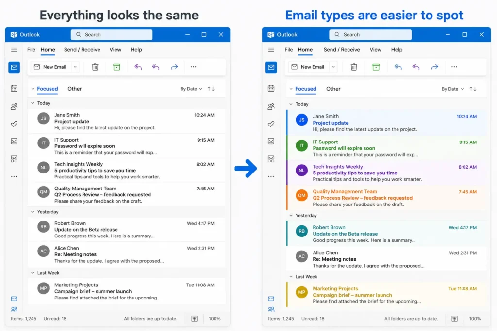
I use Outlook conditional formatting to add a few visual cues, so opening my inbox feels less like staring at a plain list of messages and more like scanning a simple dashboard.
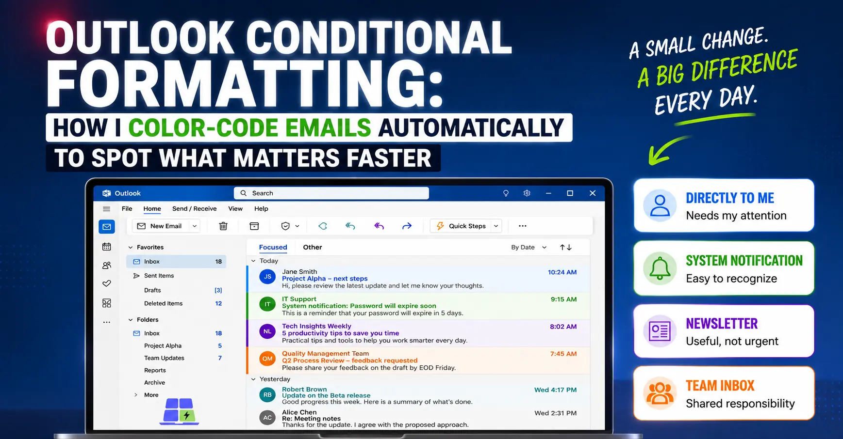
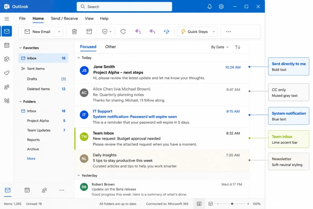
When I open my inbox, I can often tell what kind of email I am looking at before I open it: a system notification, a message sent directly to me, a shared team email, or something useful but not urgent, like a newsletter.
It is a small improvement.
But if you spend a lot of time in Outlook at work, small improvements like this make the day feel smoother.
Key Takeaways
- Make your Outlook inbox easier to scan.
- Highlight emails that need different actions.
- Start with only a few formatting rules.
- Use rules, categories, and formatting for different jobs.
- Update your color system as your work changes.
What Outlook conditional formatting does
Outlook conditional formatting lets you change how certain emails appear in the message list.
For example, you can make emails stand out based on things like:
- who sent the email
- who the email was sent to
- whether you are in the To or CC field
- words in the subject line
- specific email addresses or domains
Depending on your Outlook version and setup, you may be able to change the color, font, size, or style of matching messages.
That means you can make important patterns visible before you open the email.
Microsoft has official instructions for conditional formatting in Outlook, so I will not try to replace the full documentation here.
Instead, this article is about the workflow idea: using conditional formatting as a simple visual priority system.
Why I color-code emails in Outlook
In my work inbox, not all emails need the same kind of attention.
Some emails are sent directly to me. Those usually deserve a closer look.
Some emails arrive because I am in CC. Those may still matter, but they are often more informational.
Some emails come from internal tools, ticketing systems, automated alerts, or workflow platforms. These are useful, but they often arrive in batches and follow predictable patterns.
Some emails come from newsletters or other sources I want to read, but not during focused work.
Some emails arrive because I belong to a team mailbox, department address, or distribution list. Those messages may be relevant, but they are different from emails sent directly to me as an individual.
Conditional formatting helps me see those differences faster.
That makes Outlook feel less like a wall of identical messages and more like a dashboard I can scan.
The goal is not a prettier inbox
The goal is not to make Outlook look nice.
The goal is to make your inbox easier to read.
There is a difference.
If every type of email gets a bright color, the inbox becomes visual noise. You end up with a rainbow that does not help you decide anything.
A good color system should answer simple questions faster:
- Is this probably for me?
- Is this just FYI?
- Is this an automated notification?
- Is this something I can batch-process later?
- Is this useful reading, but not urgent work?
That is why I think of Outlook conditional formatting as a comfort feature.
It does not magically reduce the number of emails you receive.
But it can make the act of processing email feel more controlled, more predictable, and less mentally tiring.
A simple Outlook color system you can copy
You do not need a perfect system to start.
In fact, I would avoid starting with too many formatting rules.
A good starter setup could look like this:
| Email type | Possible visual treatment | Why it helps |
|---|---|---|
| Sent directly to me | Bold or stronger color | These messages are more likely to need my attention |
| CC only | Muted color | These are often informational, not owned by me |
| Automated system notifications | Distinct color | Easy to recognize and batch-process |
| Team or department emails | Separate color | Shows that the message belongs to a shared context |
| Newsletters or optional reading | Soft color, or move to a folder | Useful, but not something that should interrupt focused work |
You can adjust the exact colors to your taste.
The important part is not the specific color.
The important part is that each visual cue means something useful.
Good email types to highlight automatically
If you are not sure what to color-code, start with email types that change how you behave.
That is the key filter.
Do not highlight something just because you can. Highlight it because seeing it faster changes what you do next.
Emails sent directly to you
This is one of the most useful rules.
If an email is sent directly to you, it may deserve more attention than a message where you are only copied.
You do not have to treat this as a hard rule. Some CC emails are important too.
But visually separating “sent to me” from “I was included” can make the inbox easier to process.
Emails where you are only in CC
CC emails are often context, not action.
That does not mean you can ignore them.
It simply means they are a different category of attention.
A muted color can help you notice them without letting them dominate your inbox.
Automated notifications
Many office inboxes are full of automated emails from tools, platforms, ticketing systems, approval workflows, alerts, reports, and internal systems.
These messages can be important, but they are usually predictable.
That makes them perfect candidates for conditional formatting.
For example, you might highlight emails from a specific tool address, or emails where the subject contains a recurring keyword.
Once they have a recognizable look, you can scan them faster and process them in batches when appropriate.
Emails from shared team addresses or distribution lists
Another useful case is email that arrives because you belong to a team, department, shared mailbox, or distribution list.
These messages can be very relevant, but they are not the same as direct personal messages.
A separate color makes that distinction visible.
This can be especially helpful if you work in a role where multiple people monitor the same type of requests.
Newsletters and useful reading
I like newsletters and useful work-related updates.
But I do not want them to compete visually with real work messages.
For this type of email, you have two good options.
You can use conditional formatting to make them visually recognizable in the inbox.
Or you can use Outlook rules to move them automatically to a separate folder.
I use a mix, depending on the type of message.
If you already know that a type of email is low-value, visual formatting may not be enough. In that case, an Outlook rule can move it, keep it searchable, or even mark low-value emails as read automatically if you are sure you do not need them as action signals.
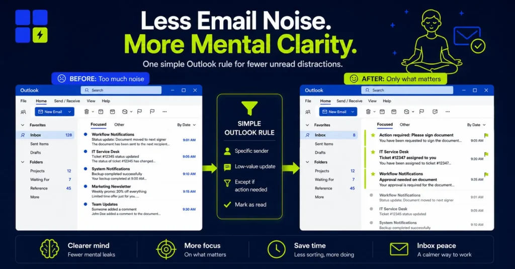
The point is not that conditional formatting is always the best solution.
The point is to make the inbox match how you actually want to process your email.
Conditional formatting vs rules vs categories
It is easy to mix up conditional formatting, rules, and categories in Outlook.
They can work together, but they do different jobs.
| Feature | What it does | When I would use it |
|---|---|---|
| Conditional formatting | Changes how matching emails look in the message list | When I want emails to stand out visually, but stay in place |
| Rules | Automatically moves, forwards, deletes, flags, or handles emails | When I want Outlook to take action on a message |
| Categories | Adds a visible label or color category to emails | When I want to manually or automatically label messages for later reference |
For example, I might use conditional formatting for system notifications that I still want to see in my inbox.
But for newsletters, I might prefer a rule that sends them to a separate folder.
Both approaches are valid.
Conditional formatting is only one small part of making email easier to manage. If you want a broader workflow, I also use a simple system to spend less time in Outlook without missing important messages.
This article is not meant to say that one system is best for everyone.
It is simply how I think about using visual cues in Outlook to make email more comfortable to process.
How to set up conditional formatting in Outlook
The exact steps depend on the version of Outlook you use.
In many work environments, people still use classic Outlook for Windows. Others are moving to the new Outlook. Your company may also control which options are available.
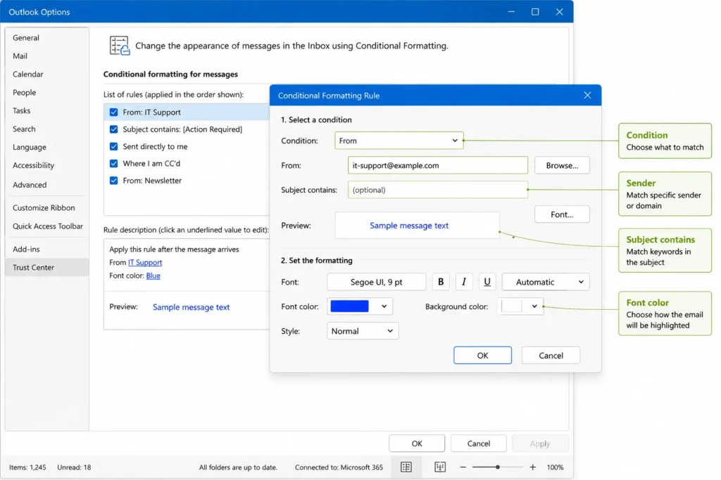
As a general idea, the process is:
- Open Outlook settings or view settings.
- Find the conditional formatting settings.
- Create a new formatting rule.
- Choose the condition, such as sender, subject, recipient, or address.
- Choose the visual style, such as color, font, or emphasis.
- Save the rule.
- Check your inbox and adjust if the result is too subtle or too distracting.
For the exact clicks, use Microsoft’s current instructions for your Outlook version.
The setup is not the most important part.
The important part is deciding what each visual cue should mean.
Start with 3 formatting rules, not 20
The biggest mistake is trying to build the perfect email system on day one.
Do not do that.
Start with three rules.
Rule 1: emails sent directly to you
Make these easier to spot.
This helps you identify messages where you are more likely to be responsible for the next action.
Rule 2: automated notifications
Pick one internal tool, workflow system, or recurring notification source.
Make those emails visually distinct.
This is especially useful if they arrive frequently and follow a predictable pattern.
Rule 3: newsletters or optional reading
Choose whether these should stay visible with a soft visual cue, or whether they should be moved to a separate folder with an Outlook rule.
Do not let optional reading look more urgent than real work.
Once those three rules feel useful, you can add more.
But only add a new rule when you notice a repeated inbox pattern that is worth separating visually.
Your color system should change as your work changes
This is a point I think many tutorials miss.
Your color system does not have to be permanent.
Mine changes over time.
When my responsibilities change, some emails become more important. Others become less important. Some tools stop being central to my work. New systems appear. New projects create new message patterns.
That means the formatting rules should evolve too.
A color that helped you six months ago may be useless today.
A rule that made sense in one role may become noise in another.
So I would treat conditional formatting as a living system.
Every now and then, ask:
- Do I still need this color?
- Does this rule still help me decide faster?
- Is this email type still important?
- Am I highlighting too many things?
- Should this email stay in the inbox, or should a rule move it somewhere else?
The best Outlook setup is not the one with the most rules.
It is the one that matches your current work.
Common mistakes to avoid
Conditional formatting is useful, but it is easy to overdo it.
Using too many colors
If everything is highlighted, nothing is highlighted.
Keep your system simple enough that you can remember what each color means without checking a guide.
Making low-priority emails too visible
Newsletters, alerts, and reports can be useful.
But if they look more urgent than messages from real people, the system is working against you.
Keeping old rules forever
Old formatting rules can become clutter.
If you no longer know why a color exists, delete or disable the rule.
Confusing visual cues with real prioritization
A color can help you scan your inbox.
It cannot decide your priorities for you.
You still need judgment.
The color is just a signal.
A small Outlook tweak that makes email feel better
Outlook conditional formatting is not a full productivity system.
It will not empty your inbox or answer emails for you.
But it can make your inbox more comfortable to use.
Start with one or two visual rules. Highlight messages sent directly to you. Make automated notifications easier to recognize. Decide what should stay in your inbox and what should go to a separate folder.
Then adjust the system as your work changes.
Your inbox should not force you to inspect every message from scratch.
With a simple color system, Outlook can give you small visual clues before you even open the email.
And sometimes, that is all you need to make email feel a little less annoying and a little easier to handle.
Want more practical Windows productivity tips? If you like simple ways to make everyday work faster, I share more practical Windows productivity tricks in the TurboTasking newsletter.