You probably know when your calendar feels full.
But do you know how many hours you actually spent in meetings last month?
Your Outlook calendar already contains most of the answer. If you can export Outlook calendar data to Excel, you can turn your meetings into a simple report instead of relying on memory or gut feeling.
The useful part is not just the export.
The useful part is building a reusable Excel dashboard that shows where your meeting time goes, then refreshing it later when you export a new calendar file.
This is not meant to be a full Power Query course. Think of it as a practical idea: export your Outlook calendar, clean it once in Excel, and build a meeting report you can reuse.
Key Takeaways
- Export your Outlook calendar to Excel to see how much time meetings consume.
- Track recurring meetings, busy weekdays, categories, and time outside working hours.
- Use the dashboard to make better calendar decisions with data, not guesswork.
Why export your Outlook calendar to Excel?
Most people use Outlook Calendar to plan the future.
But your calendar is also a record of the past.
Every meeting has useful data attached to it, such as a subject, start time, end time, organizer, attendees, location, category, and availability status.
Inside Outlook, that data is useful for joining meetings and managing your week. Inside Excel, it becomes useful for analysis.
Once the calendar is in a table, you can answer questions like:
- How many meeting hours did I have last month?
- Which recurring meetings take the most time?
- Which weekday is the most meeting-heavy?
- How much time is actually marked as busy?
- Which meetings are private, tentative, or out of office?
- How much calendar space is left for focused work?
That is hard to see from a normal calendar view. A monthly calendar can show that you are busy, but it does not easily show that you spent 48 hours in meetings.
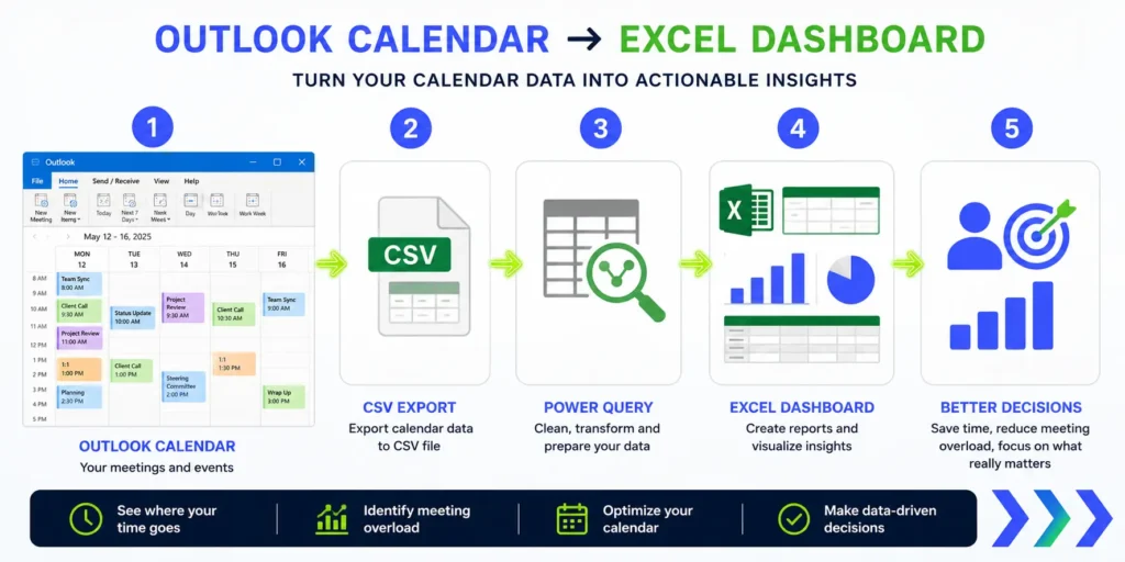
The basic workflow
The workflow is simple in concept:
- Export your Outlook calendar to a CSV file.
- Import the CSV into Excel with Power Query.
- Clean and shape the calendar data once.
- Add useful columns, such as duration, month, weekday, and meeting type.
- Build PivotTables, charts, or dashboard cards.
- Refresh the report when you export a newer CSV later.
The first setup takes a bit of work. But after that, the report can become repeatable.
Instead of rebuilding the same analysis every month, you can keep the Excel file, replace the source CSV, and refresh the query.
That is the real value of using Power Query instead of manually cleaning the file every time.
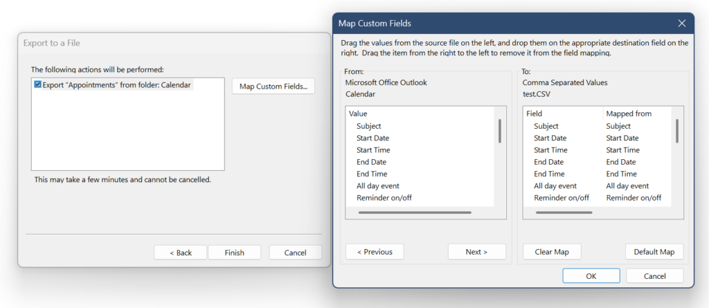
Step 1: Export your Outlook calendar to CSV
The export step depends on your Outlook version.
Classic Outlook for Windows is usually the best option for this workflow because it includes the Import and Export wizard.
Classic Outlook for Windows
In classic Outlook, the usual route is:
- Open classic Outlook.
- Go to File.
- Select Open & Export.
- Choose Import/Export.
- Select Export to a file, then click Next.
- Choose Comma Separated Values, then click Next.
- Select your Calendar folder.
- Choose where to save the CSV file.
- Use Map Custom Fields if you want to check or adjust which fields are exported.
- If Outlook asks for a date range, choose the period you want to analyze.
- Finish the export.
For a first test, I recommend exporting only one month.
That makes it easier to check whether the data looks right before you build a larger dashboard.
Once the first version works, you can export a longer period, such as the last quarter or the full year so far.
Microsoft’s Outlook import and export help page is a useful reference if your menus look different: Import and export Outlook email, contacts, and calendar.
New Outlook for Windows
New Outlook is more limited for this specific workflow.
If you are using New Outlook and cannot find a calendar export to CSV option, the most practical workaround is to switch to classic Outlook, if your company allows it, and export the calendar from there.
Do not spend too much time hunting for a hidden button in New Outlook. For this Excel reporting workflow, classic Outlook is usually the safer starting point.
If you are using a work laptop, your IT department may also restrict exports. If that happens, follow your company rules and ask what calendar export options are allowed.
Step 2: Import the CSV into Excel with Power Query
After you export the CSV file, open Excel.
The usual import path is:
- Go to the Data tab.
- Select Get Data.
- Choose From File.
- Select From Text/CSV.
- Choose the Outlook calendar CSV file.
- Open it in Power Query.
Power Query lets you clean the data before loading it into Excel.
For example, you may need to set the correct data types for dates and times, remove empty rows, filter out all-day events, or create a duration column.
Microsoft has a general Power Query reference here: Import data from data sources with Power Query.
Step 3: Check what the Outlook export contains
Before you build the dashboard, inspect the CSV.
A classic Outlook calendar export can include useful fields such as:
- Subject: the title of the meeting or calendar event.
- Start Date and Start Time: when the event starts.
- End Date and End Time: when the event ends.
- All day event: useful for excluding holidays or vacation blocks from meeting calculations.
- Meeting Organizer: useful for grouping meetings by organizer if the field is populated.
- Required Attendees: useful if you want to analyze attendee patterns.
- Optional Attendees: useful for additional attendee analysis.
- Meeting Resources: useful if rooms or resources are included.
- Categories: very useful if you categorize meetings by project, client, or type.
- Description: useful but often messy, because it may contain Teams links, meeting IDs, notes, or long email text.
- Location: useful for separating online meetings, office meetings, travel, or rooms.
- Private: useful for filtering out private events.
- Sensitivity: useful for identifying private or sensitive events.
- Show time as: useful for separating busy, tentative, free, out of office, and working elsewhere time.
This field check matters because not every report idea is equally reliable.
Reports based on dates, times, subject, all-day status, location, categories, and availability status are usually easier to build.
Reports based on attendees or client domains depend on what your export actually contains.
For example, some Outlook exports may show attendee names rather than email addresses. If that happens, you cannot reliably filter by @client.com unless you add that classification yourself.
Step 4: Create the most useful helper columns
The raw CSV is not the dashboard.
The raw CSV is just the source.
To make it useful, create helper columns in Power Query or Excel.
Useful helper columns include:
- Start DateTime: combines Start Date and Start Time.
- End DateTime: combines End Date and End Time.
- Duration Hours: the difference between end time and start time.
- Month: the month of the meeting.
- Week: useful if you want weekly reporting.
- Day of Week: useful for finding overloaded days.
- Start Hour: useful for early or late meeting analysis.
- Is All Day: useful because all-day events can distort duration totals.
- Availability: a readable version of the Show time as value.
- Meeting Type: optional grouping, such as internal, client, project, admin, or training.
- Client or Project: optional grouping, based on category, subject keyword, attendee name, or a manually added mapping.
You do not need all of these on day one.
Start with duration and month. That alone gives you your first useful meeting report.
Use “Show time as” to avoid bad meeting totals
The Show time as field is easy to ignore, but it can make your report much better.
In Outlook, availability status can be stored as a number:
| Show time as value | Meaning | How to treat it in a meeting report |
|---|---|---|
| 0 | Free | Usually exclude from meeting load |
| 1 | Tentative | Review separately or include only if relevant |
| 2 | Busy | Usually include |
| 3 | Out of Office | Usually exclude from meeting load |
| 4 | Working Elsewhere | Usually exclude or treat separately |
This is useful because your calendar may contain more than meetings.
It may also include holidays, vacation blocks, focus time, reminders, private appointments, tentative holds, or “working elsewhere” events.
If you simply sum every calendar item, your meeting number can become misleading.
A better approach is to create a clean meeting-hours metric that includes only the statuses you want to count.
For many people, that means starting with events marked as Busy, excluding all-day events, and reviewing tentative items separately.
Report idea 1: total meeting hours per month
This is the simplest report and probably the most powerful one.
Group meetings by month and sum the duration.
You might discover something like:
- January: 38 meeting hours
- February: 44 meeting hours
- March: 51 meeting hours
That number changes the conversation.
“I have too many meetings” is easy to ignore.
“I spent 51 hours in meetings last month” is much harder to ignore.
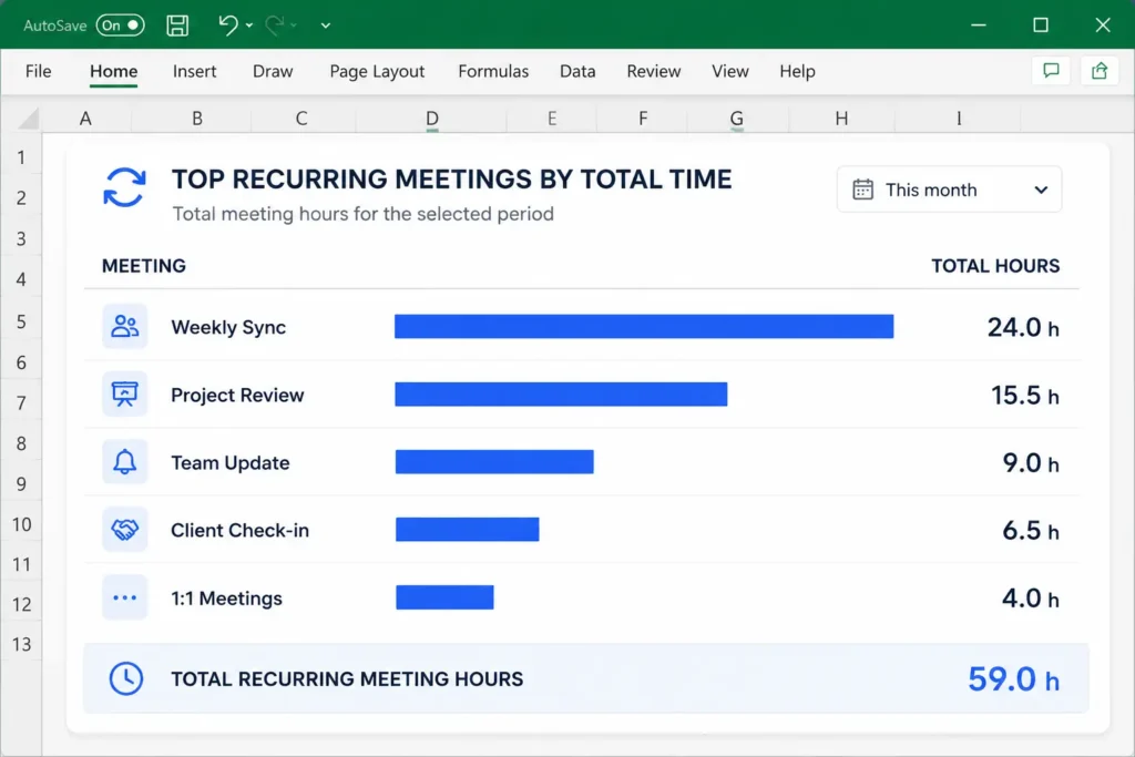
Report idea 2: recurring meetings by total time
Recurring meetings are easy to underestimate.
A 30-minute weekly meeting sounds harmless.
But over a year, that can become more than 25 hours before you count preparation, context switching, or follow-up work.
A meeting dashboard can show your recurring meetings by total time.
For example:
- Weekly project sync: 24 hours this year
- Daily status check: 40 hours this year
- Monthly steering call: 12 hours this year
This does not mean every recurring meeting is bad.
It simply helps you see which ones are expensive.
Then you can ask better questions:
- Does this meeting still need to happen?
- Could it be shorter?
- Could it happen every two weeks instead?
- Could part of it become an async update?
Report idea 3: meeting-heavy weekdays
Some days are not really workdays anymore.
They are meeting days.
If you group meeting hours by weekday, you might find patterns like:
- Monday is overloaded with planning calls.
- Wednesday is full of client meetings.
- Friday has too many status updates.
- Tuesday morning is your best deep work window.
This is useful because it helps you protect time realistically.
Instead of saying “I need more focus time”, you can say:
Wednesdays are already packed with meetings, so I will protect Tuesday morning for focused work.
That is a better decision because it is based on your actual calendar pattern.
Report idea 4: meetings outside working hours
If you work across time zones, support global teams, or regularly join early and late calls, your calendar can show that too.
Create a simple rule such as:
- before 9:00, early meeting,
- between 9:00 and 17:00, normal working hours,
- after 17:00, late meeting.
Then count how many meetings fall outside your normal working window.
This can make hidden overload visible.
One late call does not look like much. Ten late calls in a month tell a different story.
Report idea 5: meeting time by category or project
If you already use Outlook categories, they can become very useful in Excel.
For example, you might categorize meetings as:
- Client
- Internal
- Project
- Admin
- Training
- One-to-one
Then your Excel dashboard can show how your meeting time is split across those categories.
This is often more reliable than trying to infer everything from meeting subjects.
Meeting subjects can be messy. Categories are cleaner if you use them consistently.
Report idea 6: meeting time by organizer
If your export includes the Meeting Organizer field, you can also group meeting time by organizer.
This can be useful if you want to understand where your meetings come from.
For example, you might discover that most of your meeting time comes from:
- one project lead,
- one recurring team rhythm,
- one customer-facing group,
- or your own self-created meetings.
Use this carefully.
The goal is not to blame people. The goal is to understand which workflows are creating calendar load.
Report idea 7: meeting time by client
This is one of the most useful advanced reports, but it depends on the data you have.
If your export includes attendee email addresses, you may be able to identify client meetings by domain.
For example, if a client uses addresses like:
@client.com
you could flag meetings that include that domain and estimate meeting time for that client.
This can help you answer questions like:
- Which client takes the most meeting time?
- Are low-revenue clients consuming too much calendar space?
- Did this project require more meetings than expected?
- Should we change the meeting rhythm for this account?
But this will not always work directly from a default Outlook export.
In some exports, attendee fields contain display names rather than email addresses. If that is your case, domain filtering will not work unless you add another classification step.
Alternatives include:
- using Outlook categories for client meetings,
- adding a client name manually after importing,
- using consistent subject prefixes, such as “Client A”,
- mapping known attendee names to a client or project,
- creating a cleaner reporting habit going forward.
Also treat this as an estimate, not as formal billing data.
The best system is the one you can maintain without turning calendar analysis into another job.
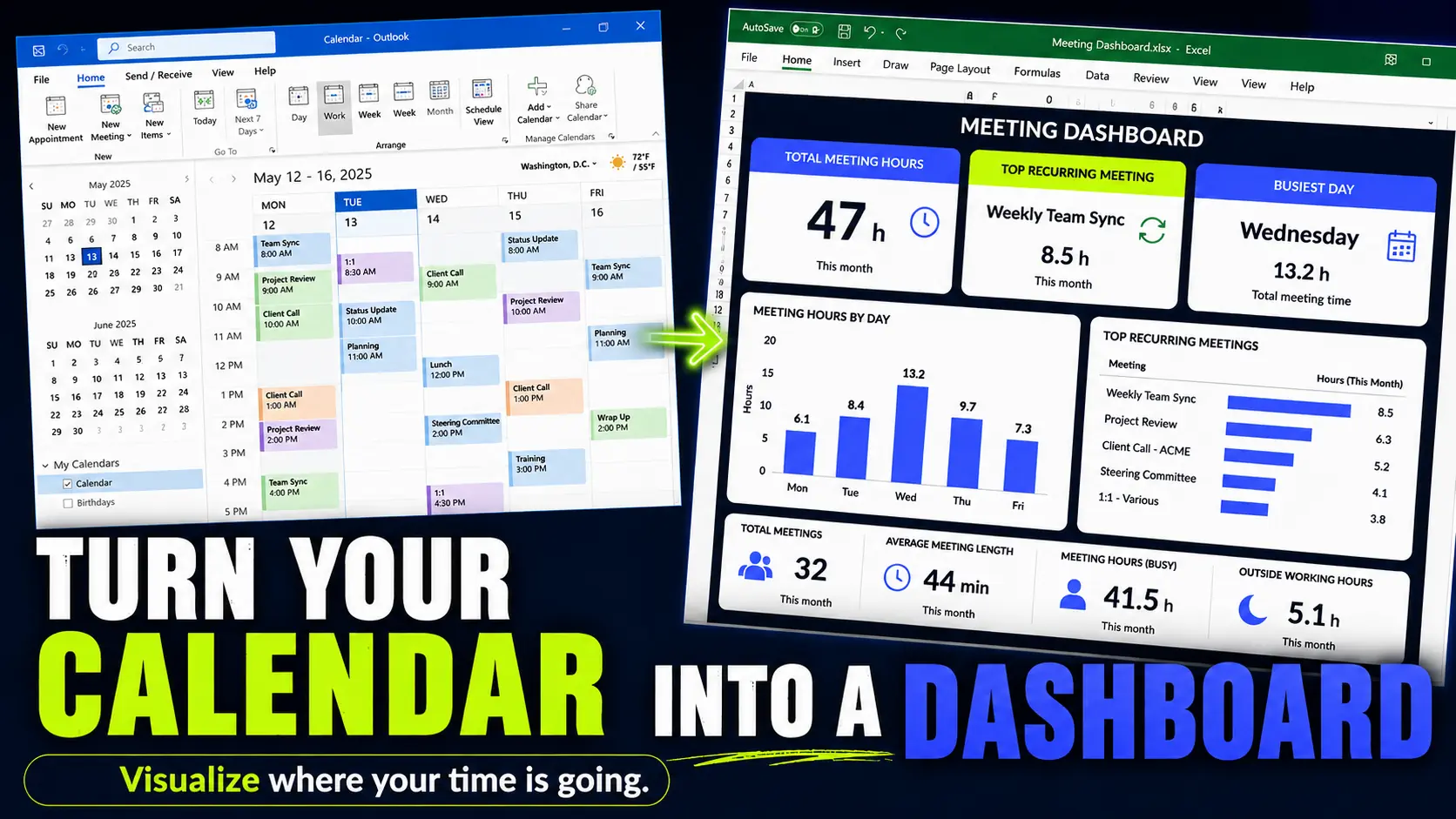
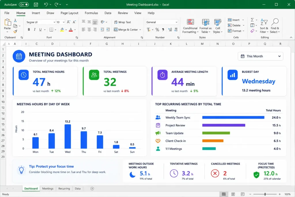
What your Excel meeting dashboard could show
A useful dashboard does not need to be complicated.
In fact, the best first version is usually simple.
You could include a few of these:
- Total meeting hours this month
- Number of meetings
- Average meeting length
- Meeting hours by weekday
- Top recurring meetings by total time
- Meetings outside working hours
- Busy versus tentative versus free time
- Meeting time by category
- Meeting time by organizer
- Meeting time by client, if your data supports it
The dashboard is what makes the data hard to ignore.
A CSV file with hundreds of rows is not motivating.
A dashboard card that says “47 meeting hours this month” is much clearer.
The best part: refresh the report next month
The first version of the report is the hardest.
You need to export the data, import it into Excel, clean it, add helper columns, and build the dashboard.
But once the Power Query steps are set up, the next update can be much easier.
There are two simple ways to make the report repeatable.
Option 1: replace the old CSV with a new one
The simplest version is:
- Export a new Outlook calendar CSV.
- Save it with the same file name as the previous source file.
- Replace the old CSV with the new one.
- Open the Excel report.
- Refresh the query.
- Review the updated dashboard.
This works well if you only care about one reporting period at a time, such as the current month.
Option 2: keep monthly exports in one folder
My favorite approach is to save each monthly export in the same folder and let Power Query import all CSV files from that folder.
For example, you could keep files like:
outlook-calendar-2026-01.csv
outlook-calendar-2026-02.csv
outlook-calendar-2026-03.csv
Then Power Query can combine the available files into one table.
The next time you export a new month, you simply add the new CSV to the folder and refresh the report.
This is especially useful if you want to build a longer-term meeting history instead of replacing last month’s data every time.
With this setup, your dashboard can show trends over several months, such as whether your meeting load is increasing, which recurring meetings keep consuming time, and whether your calendar changes are actually working.
That means the dashboard can stay useful without rebuilding it from scratch every month.
This is why I would not build this as a one-time manual spreadsheet.
If you are going to analyze your meeting time more than once, it is worth setting up a repeatable report.
What you can do with the numbers
The goal is not to make a pretty dashboard.
The goal is to make better calendar decisions.
Once you can see your meeting load, you can use the numbers to:
- shorten recurring meetings from 60 minutes to 45 minutes,
- move weekly meetings to every two weeks,
- cancel meetings that no longer have a clear purpose,
- batch client calls into fewer days,
- protect deep work blocks on your least meeting-heavy days,
- show your manager that your meeting load is too high,
- compare meeting time before and after changing your calendar habits.
The report gives you evidence.
Instead of saying:
I feel like I spend too much time in meetings.
you can say:
I spent 52 hours in meetings last month, and 18 of those hours came from recurring status calls.
That is a much stronger starting point for changing how your calendar works.
Limitations to keep in mind
This kind of Outlook meeting report is useful, but it is not perfect.
Before you trust the numbers too much, keep these limitations in mind:
- A calendar event is not always real attendance. You may have skipped a meeting that still appears in your calendar.
- Tentative meetings can distort the report. Review them separately if they are not always real meetings.
- All-day events can break duration calculations. Treat them separately.
- Free, Out of Office, and Working Elsewhere items are not normal meetings. Decide whether to exclude them.
- Private events may have limited detail. That is usually good for privacy, but it can reduce reporting value.
- Attendee data may not export as email addresses. Do not build the whole dashboard around client domains until you check your CSV.
- The Description field can be messy. It may contain Teams links, meeting IDs, long notes, or forwarded text.
- Company policies may restrict exports. Follow your organization’s rules.
Also, be careful with sensitive data.
A calendar export can include names, email addresses, meeting subjects, client references, Teams links, meeting IDs, and internal project details. Store it responsibly and do not upload it to unapproved tools.
A simple version to build first
If this sounds too big, start smaller.
Your first version only needs five things:
- Export one month from classic Outlook.
- Import the CSV into Excel with Power Query.
- Create a duration column.
- Filter out all-day events and non-meeting statuses if needed.
- Create one PivotTable showing total meeting hours.
That is enough to get value.
After that, add one extra layer at a time:
- weekday analysis,
- recurring meetings,
- meeting categories,
- organizer analysis,
- client or project tags,
- meetings outside working hours.
Do not try to build the perfect dashboard immediately.
The first useful number is enough: total meeting hours.
Final thought
You do not need a perfect time tracking system to learn something useful about your work.
Your Outlook calendar already tells a story.
Exporting that calendar to Excel simply makes the story visible.
Once you can see how many hours go into meetings, recurring calls, overloaded weekdays, and client discussions, you can start making better calendar decisions with data instead of gut feeling.
Want more practical Windows productivity tips? If you like simple ways to make everyday work faster, I share more practical Windows productivity tricks in the TurboTasking newsletter.