
Conditional formatting is often treated as a way to make Excel look more colorful.
Its real value is making a large worksheet tell you where to look.
A good rule answers a work question: Which tasks need attention today? Which invoices look unusual? Which KPIs are falling behind target? Which rows can wait until the next review?
This article gives you 10 practical examples for real work. You will not find an exhaustive tour of every Excel menu. Instead, each example follows the same pattern:
- Question: what do you need to know?
- Rule: what should Excel test?
- Signal: how should the result stand out?
- Action: what should you do next?
For the exact mechanics of creating and managing rules, use Microsoft’s official guide to conditional formatting in Excel. The useful part is choosing a rule that helps you make a decision.
Key Takeaways
- Useful conditional formatting makes exceptions harder to miss, not merely spreadsheets more colorful.
- Match the rule to the decision: dates for exceptions, bars for magnitude, icons for thresholds, and scales for patterns.
- An Excel Table plus color filtering can turn automatic alerts into a focused review queue.
In this article
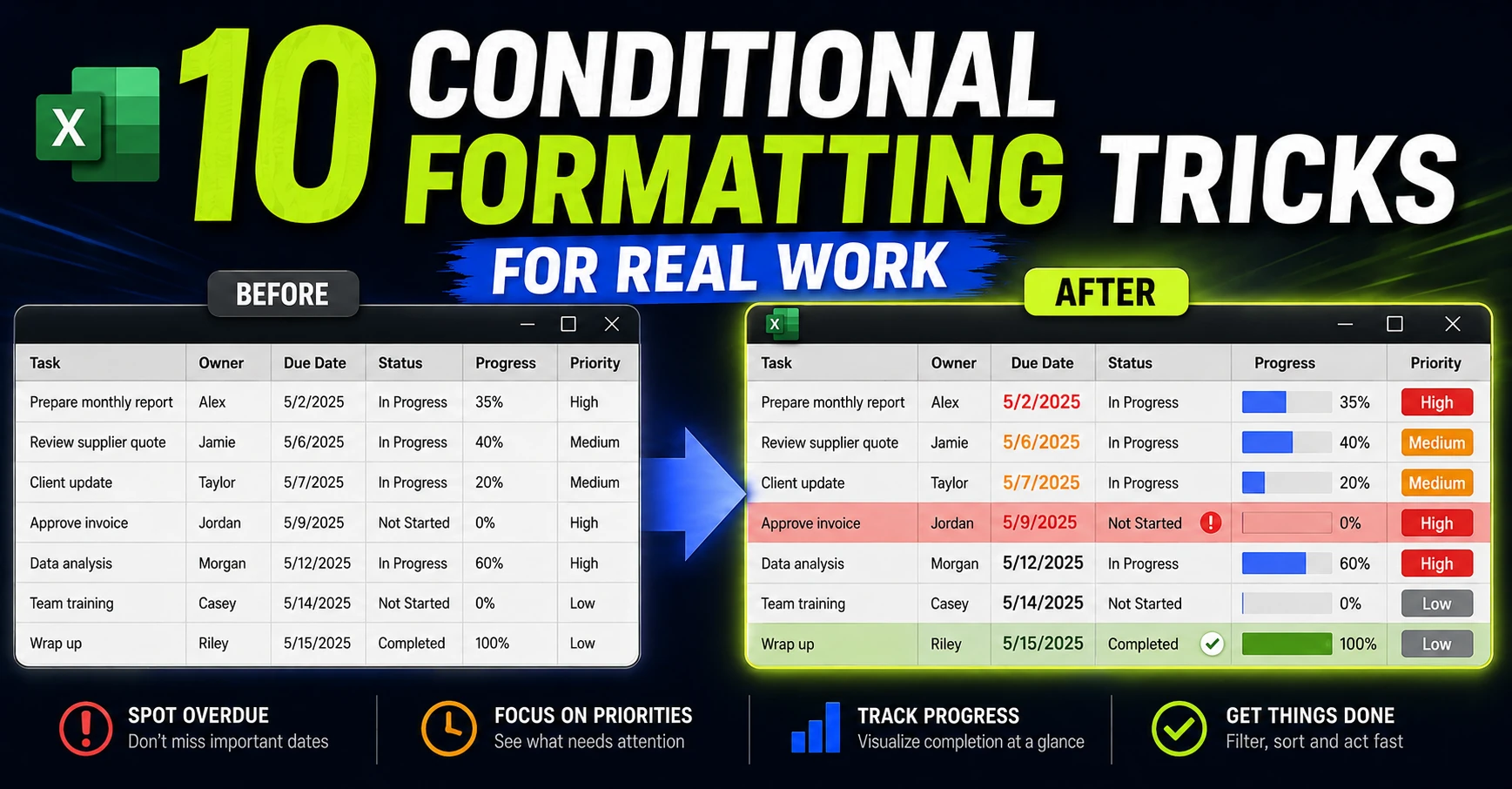
1. See overdue or upcoming deadlines before they become surprises
The problem
A task list can contain a Due Date column and still make late work difficult to spot. When the list grows, manually scanning dates becomes an unreliable part of every review.
The rule
Highlight dates that are before today, or dates that fall within a short upcoming window. For a task tracker, combine the date with the status so a completed task does not remain red after it is finished.
A typical logic is:
Due Date < TODAY() and Status is not “Done”
The signal
Use a strong but readable fill for overdue items and a softer warning color for items due soon. If the deadline matters across the whole task, format the entire row rather than only the date cell.
The action
Start the review with the red rows, then check the amber rows before they become tomorrow’s red rows.
Watch out for
Blank dates, text that looks like a date, and completed items need explicit handling. A color should reflect a defined business rule, not a vague feeling that a date looks old.
2. Make blocked, waiting, or late rows impossible to miss
The problem
Status columns are useful only if the status changes what you do next. A row labelled Blocked can disappear inside a long table when every row has the same visual weight.
The rule
Use a formula-based rule that checks the status cell in each row. For example, if Status is in column I, a rule such as =$I2=”Blocked” can apply a format to the full data range.
The same pattern can handle Waiting, Late, Needs review, or other states that deserve attention.
The signal
Apply a clear row-level signal: a left border, a pale fill, or a visible status accent. Avoid making every state equally loud. The purpose is to establish a hierarchy of attention.
The action
Filter or sort the table by the status column, then work through the blocked or waiting rows as a separate queue.
Watch out for
The Applies to range and the mixed reference matter. If the rule points to the wrong row or column, Excel may highlight the wrong records. Test the rule with two or three deliberately different statuses before trusting it.
3. See project progress without checking every percentage
The problem
A column of percentages is precise but slow to compare. A manager reviewing 20 workstreams should not have to read every number to see which items are barely started and which are nearly complete.
The rule
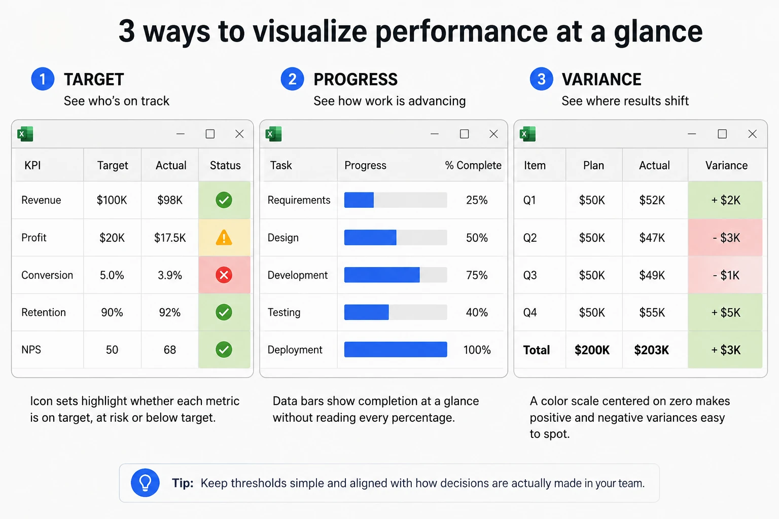
Apply Data Bars to a completion percentage or completed-items column. The bar length provides a quick comparison while the number preserves the exact value.
The signal
Use a restrained single-color bar for progress. Keep the percentage visible unless the worksheet is intentionally designed as a compact visual dashboard.
The action
Scan for short bars, then investigate whether the work is genuinely behind or simply has a different planned duration.
Watch out for
The minimum and maximum settings affect the meaning of the bars. A bar scaled against the selected range can answer a different question from a bar scaled from 0% to 100%. Choose the scale deliberately.
4. Spot KPIs that are falling behind target
The problem
A KPI report can show actual values and target values while leaving the reader to calculate the gap mentally. That makes review meetings slower and increases the chance that a weak result is missed.
The rule
Use an icon set or simple threshold rules based on the business target. For example, green can mean at or above target, amber can mean close but below target, and red can mean materially behind.
The important detail is that the thresholds should be fixed numbers when they represent a real target. Automatic percentiles may create attractive icons but do not necessarily represent success or failure.
The signal
Use icons alongside the value, not instead of it. The icon gives the quick classification; the number explains the size of the result.
The action
Open the review with red and amber KPIs. Ask whether the issue is a one-off, a forecast problem, or a signal that the action plan needs to change.
Watch out for
The meaning of green and red depends on the metric. For some measures, a lower number is better. Define the direction explicitly and avoid using red and green as the only way to communicate the result.
5. Find budget and forecast variances before the review meeting
The problem
Actual-versus-plan tables often contain the information needed for a useful conversation, but the important deviations are hidden among normal differences.
The rule
Calculate the variance and apply a two- or three-color scale. Center the scale on a meaningful midpoint such as zero or the approved target, rather than letting Excel choose a midpoint that only describes the distribution.
The signal
Use a divergent scale so positive and negative movement are visually distinct. The exact colors should reflect the meaning of the metric: a cost overrun and a revenue increase do not necessarily deserve the same interpretation.
The action
Look for clusters of unfavorable variance, not just the single most extreme cell. Those clusters are better candidates for a forecast adjustment or management discussion.
Watch out for
One extreme value can make the rest of the range look similar. If that happens, review the scale settings and consider whether the worksheet needs a separate outlier check.
6. Find low-stock, overloaded, or under-capacity items
The problem
Threshold problems are common in office work: inventory below reorder level, support queues above capacity, response times above a service target, or resources with too little available time.
The rule
Highlight values below or above the threshold that matters. If the threshold lives in another column, compare the two values rather than hard-coding a number that may change.
The signal
Format the value for a quick scan, or extend the signal across the row when the owner, item, and next action matter together.
The action
Use the highlighted items to create a replenishment, staffing, or escalation list.
Watch out for
The threshold must come from the process. A visually convenient number is not automatically a useful business limit. Record the unit and time period so that 48 hours, 48 minutes, and 48 cases are not confused.
7. Catch duplicates and potentially problematic records
The problem
Duplicate invoice numbers, customer IDs, ticket references, or names can distort a report without producing an obvious formula error.
The rule
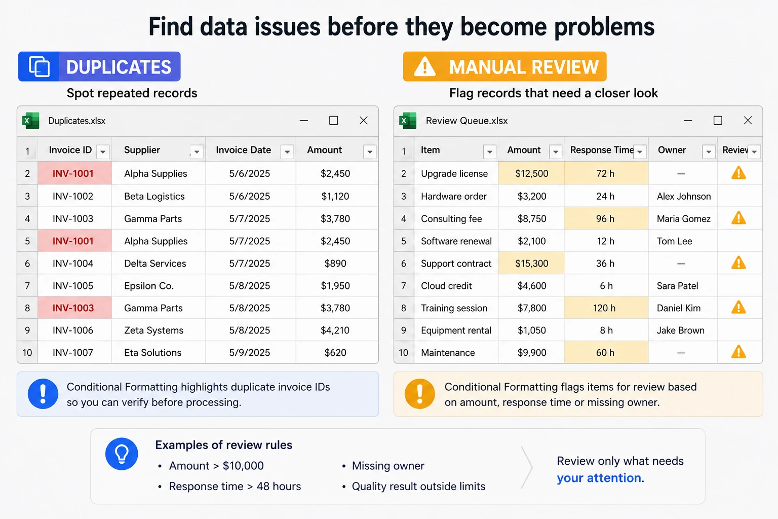
Use Excel’s built-in Duplicate Values rule, or a COUNTIF-based rule when the duplicate logic needs to be scoped to a specific range or combined with another condition.
Microsoft’s duplicate-values guidance is useful here because highlighting is a review step. It is safer than deleting records immediately.
The signal
Use a clear but limited warning style on the duplicate field. If the duplicate affects the whole record, highlight the row only after the matching field is easy to identify.
The action
Review the records, decide which one is correct, and document the reason before removing or merging anything.
Watch out for
A duplicate value is not proof of a duplicate record. Two rows can legitimately share a name, product, or date. Treat the signal as a prompt for verification.
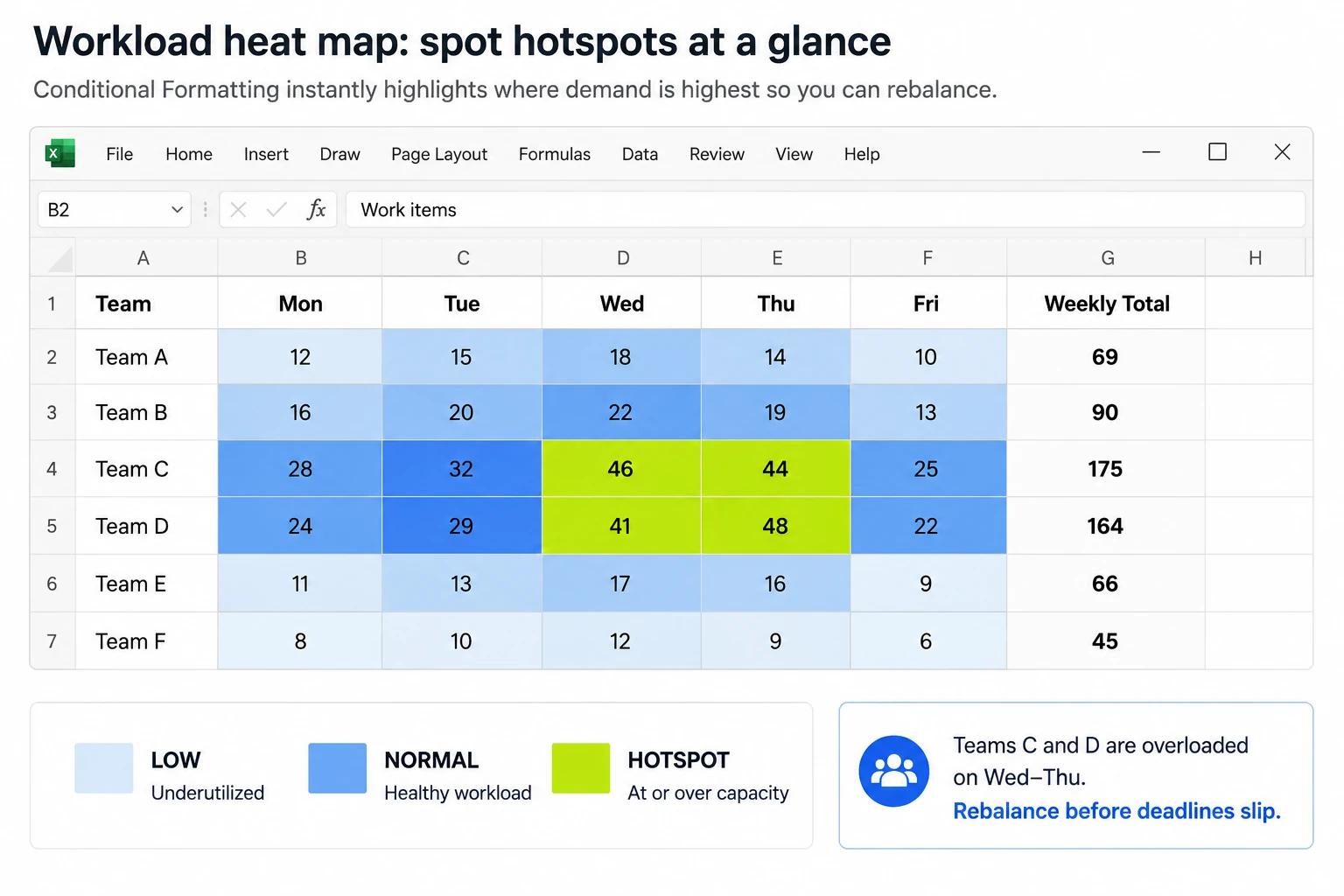
8. Find workload hotspots across teams, days, or regions
The problem
A matrix of workload, response times, activity, or regional results can contain patterns that are difficult to see when every cell has the same fill.
The rule
Use a color scale to show relative intensity. Use a sequential scale when higher simply means more. Use a divergent scale when there is a meaningful midpoint, such as a target response time or zero variance.
The signal
A heat map makes clusters visible: a team with repeated overload, a day with unusually high demand, or a region whose response times are consistently different.
The action
Investigate the hotspot, rebalance work, or decide whether the process needs a different capacity target.
Watch out for
Do not call every colored matrix a useful heat map. The colors should answer a real work question, and the legend or surrounding labels should explain what high and low mean.
9. Highlight values that need manual review
The problem
Some records are not simply good or bad. They need a human check because several conditions come together: an invoice is above a threshold, a response took too long, a quality result is outside limits, or an owner is missing.
The rule
Use a formula that combines conditions with AND or OR. For example, a review rule might test whether an amount is above a limit and the owner is blank, or whether a response time exceeds 48 hours or the quality result is outside the accepted range.
This is where a formula-based rule adds value without turning the article into a formula tutorial.
The signal
Use one review color and a short note or status column. A neutral review signal is often better than red because it says “check this” rather than “this is definitely wrong.”
The action
Filter the records and perform the manual check. Once the decision is made, update the source status so that the formatting can reflect the new state.
Watch out for
Write the business rule in plain language before building the formula. If nobody can explain what should be true, the formula will be difficult to audit later.
10. Turn an Excel Table into a focused review queue
The problem
Conditional formatting can show exceptions, but a large workbook still contains all the normal rows. The next productivity step is to hide what does not need attention.
The workflow
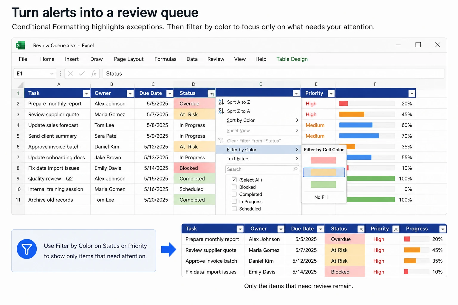
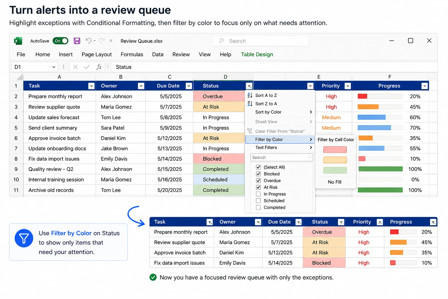
1. Convert the range into an Excel Table so headers and filters are available. 2. Add conditional formatting that represents a meaningful exception or priority. 3. Use the table’s filter or sort controls to focus on the relevant cell color, font color, or icon. 4. Review the visible rows and update the underlying status or owner field. 5. Clear the filter when the review is complete.
Microsoft documents filtering by color and sorting by color or icon. The exact menu options should still be tested in the Excel version used by your team.
Why this is a power move
The workbook is doing two jobs in sequence:
- Conditional Formatting detects and signals the exceptions.
- The Table filter turns those signals into a small action list.
That is more useful than making every row visually interesting. You are not processing the entire workbook faster; you are avoiding the work that does not need your attention.
Watch out for
Keep a real Status, Priority, or Review Required column. Color is a view layer and should not be the only source of meaning. Also test whether the exact conditional-formatting result can be filtered in your version before building a process around it.
3 Conditional Formatting mistakes to avoid
1. Do not use color without meaning
Every color should answer a question or trigger an action. If readers need a legend to remember what five decorative colors mean, the rule set is probably too complicated.
2. Do not let automatic scales choose business thresholds
Relative rankings are useful for spotting patterns. They are not the same as approved targets, limits, or service levels.
3. Do not make color the only source of information
Keep the value, status, label, or icon visible. Use contrast and text so that the workbook remains understandable when printed, viewed by people with color-vision differences, or opened in a different theme.
A practical way to start
Choose one recurring review problem instead of formatting the whole workbook at once.
If deadlines cause the most wasted attention, start with overdue and due-soon rules. If meetings revolve around targets, start with KPI thresholds. If a table is too large to review, combine Conditional Formatting with filters and create a small review queue.
The goal is not a prettier spreadsheet. It is a spreadsheet that makes the next useful action easier to see.
Want more practical Windows productivity tips? If you like simple ways to make everyday work faster, I share more practical Windows productivity tricks in the TurboTasking newsletter.